- Updated
Podcast / channel cover art
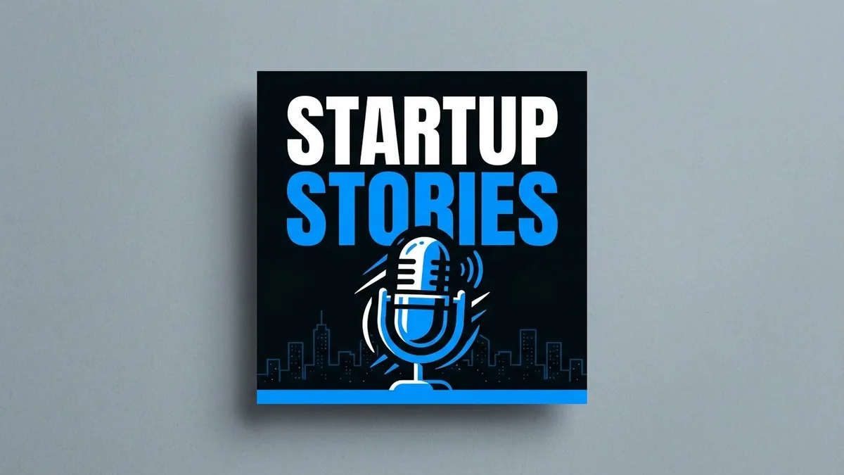
This prompt designs square cover art for your podcast, with a bold title that stays readable even at thumbnail size and a visual such as a microphone over a city skyline. View the result small before you use it.
Design square cover art for a podcast called "[PODCAST NAME]" about [TOPIC, e.g. startups in India].

Bold title text that stays readable even as a tiny thumbnail, and [VISUAL, e.g. a microphone icon with a subtle city skyline]. A [COLOURS, e.g. black, electric orange, and white] palette, high contrast, modern and clean.

Spell the name exactly as written. Square 1:1, high resolution.
View it at thumbnail size — if you can't read the title, make it bigger.
Get a better result
A square 1:1 podcast cover with a bold title that stays readable at thumbnail size, a visual idea such as a microphone and skyline, a high-contrast palette and a modern, clean look.
The podcast name is misspelled or too small to read.
Fix: Keep it to two or three words, make it the biggest element, and check the result at 150 pixels wide. Add the name in an editor if the spelling is off.
- The cover is full of tiny detail that disappears when shrunk. Use one central icon and a plain background. Details vanish in podcast apps.
- The colours are loud but low-contrast. Choose one very light and one very dark colour for the title and the background. Contrast beats colourfulness for readability.
Ask for “the same design with a different icon for each of three episodes, the title in the same position”. A system helps listeners recognise your show.
Make the title the largest element, high contrast, spelled exactly as in my prompt, with one central icon and no small details.
Guides that use this prompt
More image generation prompts
See all 347 →
More like this
- Professional book coverIdeogram · Midjourney · ChatGPT
- High-CTR YouTube thumbnailGemini · ChatGPT
- Podcast host in the studioGemini · ChatGPT
- Outline a podcast episodeChatGPT · Gemini · Claude
- Online course cover thumbnailGemini · ChatGPT · Midjourney