- Updated
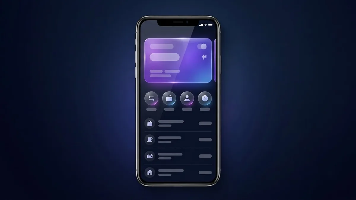
Mobile banking app UI concept
This prompt creates a fintech home screen concept with a balance card at the top, send, request and pay buttons, a recent transactions list and a small spending chart, in a dark or light theme on a phone mockup. It uses placeholder amounts, not real data.
Mobile banking app home screen UI concept. A balance card at the top with placeholder amount, quick action buttons for send, request and pay, a recent transactions list with icons, a small spending chart, [DARK / LIGHT] theme with [COLOUR] accents, rounded cards, clean modern fintech design, shown on a phone mockup. --ar 9:16
Use dummy numbers only. AI-made UI is for concepts, not for real financial data.
Get a better result
A tall phone mockup of a banking app home screen in your theme and accent colour: a balance card on top, send, request and pay buttons, a short transaction list with icons and a small spending chart, all on rounded cards.
Listing the parts of the screen in reading order gives the model a layout to follow, top to bottom. The theme and accent blanks set the whole mood with two words. Asking for a phone mockup at 9:16 shows the design at real proportions, which is how a client or teammate will judge it, and the dummy amounts keep it clearly a concept.
The numbers and labels are garbled.
Fix: Expect it in small text. Use the picture for layout and colour, and set the real labels in a design tool, with dummy numbers as the tip says.
- The screen is crammed with every feature. Name only the parts you listed and add “lots of space between cards” so the hierarchy reads at a glance.
- The accent colour is used everywhere. Ask for the accent on buttons and the chart only, with neutral cards, so the important actions stand out.
Ask for the next screen in the flow: a contact picker, an amount keypad and one big confirm button, in the same style.
Make the same screen in the other theme, with the same layout and labels, so I can compare dark and light side by side.
More image generation prompts
See all 347 →

More like this
- App store screenshot with captionIdeogram · ChatGPT · Gemini
- App dashboard UI mockup for a pitch deckChatGPT · Gemini · Midjourney
- Cafe interior conceptMidjourney · Gemini · ChatGPT
- Modern app icon designGemini · ChatGPT · Midjourney
- Sci-fi spaceship concept artMidjourney · Gemini · ChatGPT