Canva AI prompts: business graphics worth the first try
Published
Short answerName the exact layout you need, such as columns or a grid, and put any real text in quotes so Canva's AI keeps it legible. Treat the first result as a draft you adjust in the editor, not a finished file.
Canva built its AI assistant, Canva AI, into the Visual Suite: the same workspace that already holds Canva Code, Canva Sheets and the Photo Editor, so a generated design lands somewhere you can keep editing rather than a standalone export. Maginative's coverage of the Visual Suite launch describes Canva AI as a conversational assistant that combines Canva's generative tools in one interface.
Canva has kept adding to that workspace since. TechRepublic reported that Canva shipped more than 100 Visual Suite upgrades in 2026 across Docs, Sheets, Whiteboards and presentations, built from over 55,000 user requests and ideas. None of that changes how you should write a Canva AI prompt, but it does mean more of your work can plausibly start there instead of in a separate tool.
Treat the first result as a layout, not a finished file
The biggest difference between Canva AI and a plain image generator is that you can open what it makes and keep editing: move a text box, swap a colour, resize an element. So don't try to get every detail right in the prompt. Describe the structure you need, generate, then fix the small stuff by hand. Asking for five rounds of "make the logo a bit bigger" wastes more time than just dragging it.
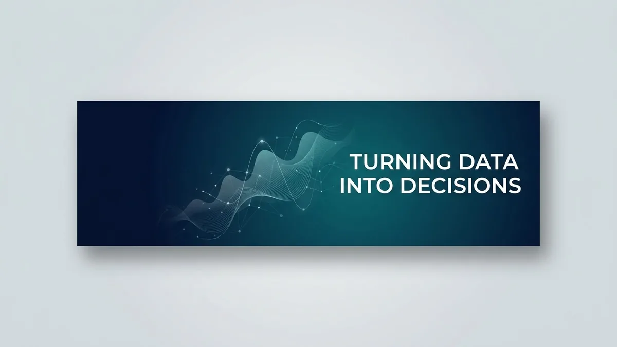
Design a professional LinkedIn banner (very wide, 4:1) for a [ROLE, e.g. data analyst].

Place the text "[NAME] · [WHAT YOU DO, e.g. Turning data into decisions]" on the right side in a clean sans-serif. Keep the left third mostly empty — the profile photo covers that area.

Style: minimal and modern, [COLOURS, e.g. deep blue with subtle abstract data lines], a subtle texture, and no stock-photo people.
This is the LinkedIn banner prompt. Notice it describes the layout in plain terms a banner actually needs, like which third stays empty, rather than trying to specify exact pixel positions.
Put every word of real text in quotes
Any text that has to be correct, a name, a price, a heading, belongs inside quotation marks in your prompt. Canva's AI is far more likely to spell it right and keep the formatting when the exact words are marked off from the rest of the instruction.
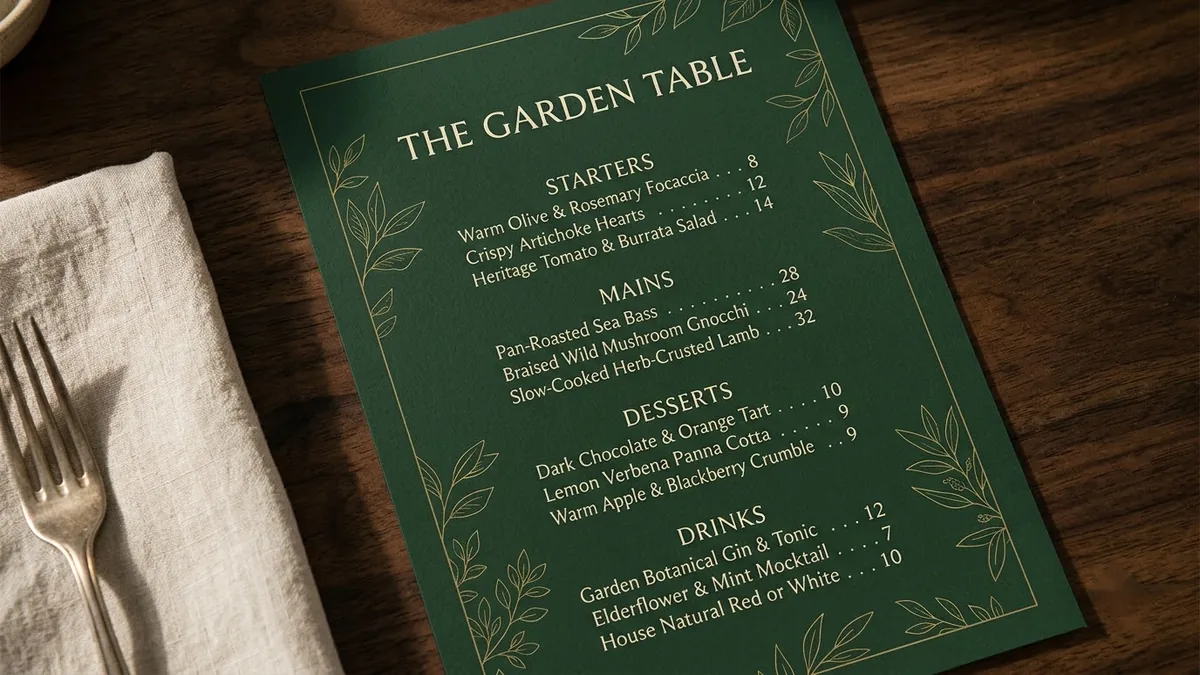
A one-page restaurant menu design for "[RESTAURANT NAME]", a [CUISINE] restaurant. Sections: Starters, Mains, Desserts, Drinks, each with three items and prices like "[ITEM] — [PRICE]". Elegant [DARK / CREAM] background, [COLOUR] accents, delicate line illustration of [MOTIF], easy-to-read typography, balanced spacing.
That's the restaurant menu design prompt. Even with the quotes, check every price and item name after it generates. Menus have a lot of small text, and that's exactly where an AI model is most likely to drop a word or swap a digit. Fix typos directly in Canva's text editor rather than asking the AI to regenerate the whole menu.
Name the diagram shape, not just the topic
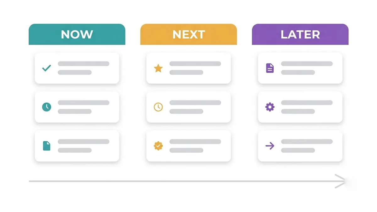
For business graphics, the shape of the diagram matters more than the words in it. "A roadmap graphic" is vague. "Three columns labelled Now, Next and Later" tells Canva AI exactly what to lay out, which is the difference between a usable draft and something you redo from scratch.
Product roadmap graphic with three columns labelled Now, Next and Later, each with three rounded cards with short placeholder feature names and small icons, connected by a subtle timeline arrow, [COLOUR] palette, tidy modern product-management presentation style.
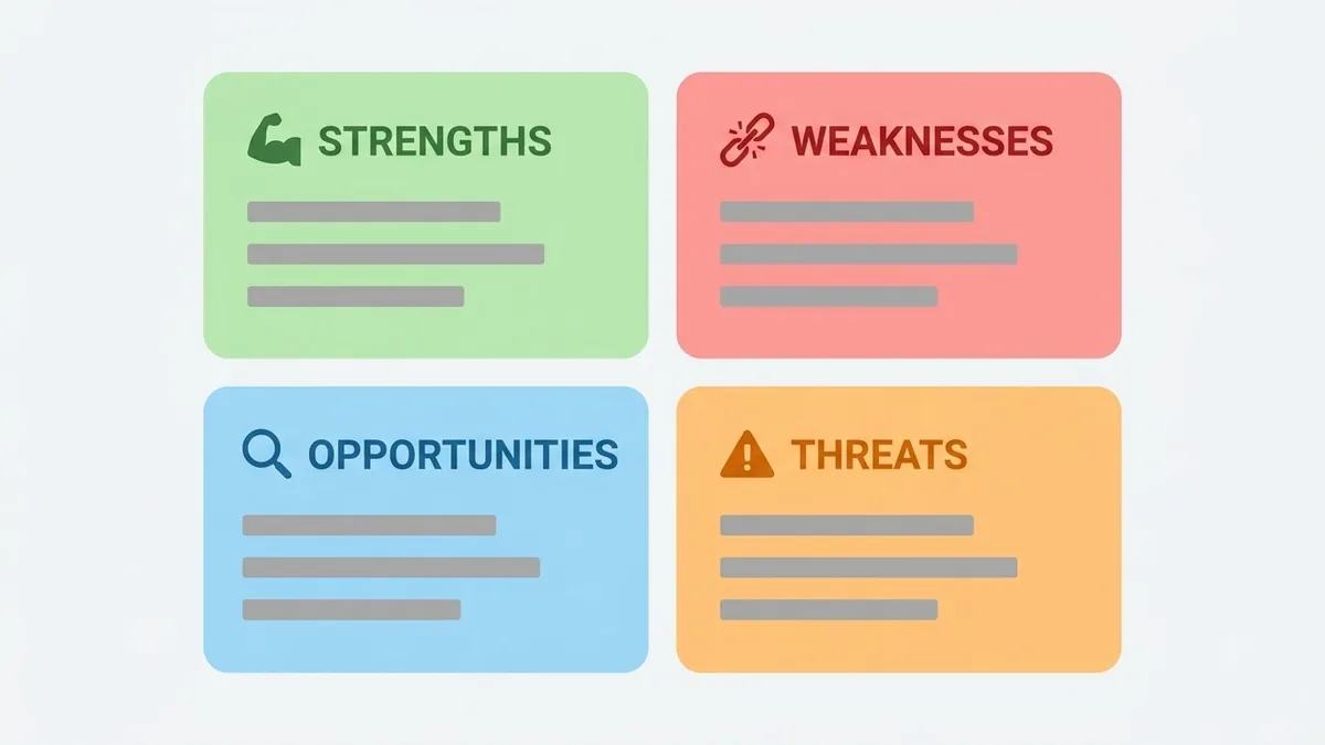
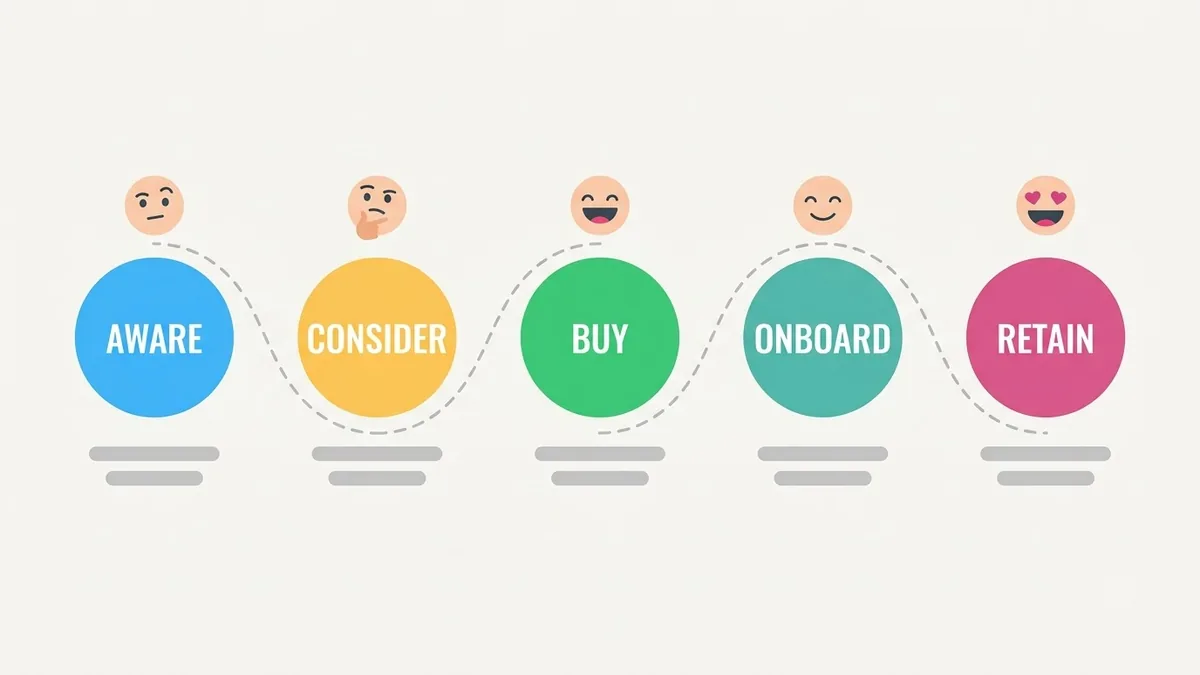
The product roadmap graphic prompt names the exact structure: three columns, rounded cards, a connecting line. The SWOT analysis graphic prompt does the same with a 2x2 grid, and the customer journey map prompt names the five stages along the top. In every case, write the real text into the editor afterwards rather than trying to get specific business details right inside the prompt. The placeholder layout is what you're asking the AI for; your actual content goes in by hand.
Keep brand elements out of the AI step
If you're generating something for a business that already has a logo, a font or an exact colour code, don't try to describe them precisely enough for the AI to match. It won't be pixel-perfect, and a near-miss on a brand colour is worse than an obvious placeholder. Generate the layout with a placeholder colour and swap it for your brand's exact hex code afterwards in Canva's editor, where it will actually be correct.
A habit worth keeping: generate, then simplify
If a result looks cluttered, the fix is rarely a longer prompt. Try asking for fewer elements instead: "same layout, but only 3 bullet points" or "remove the icons, keep the text." Canva AI, like most design tools, tends to add detail when it's unsure what you want, and the cleanest business graphics usually have less in them, not more.
Where to go from here
If you're designing for a specific business beyond one graphic, see our prompts for small businesses, which cover the writing side alongside the visuals. Browse more ready-made layouts in marketing prompts, or use the prompt builder to adapt any of the prompts above to your own brand and colours.
Quick checklist
- Describe the structure (columns, grid, sections), not pixel-level detail.
- Put any real text, names, prices or headings in quotation marks.
- Check every word of generated text before you publish, especially on menus and labels.
- Keep exact brand colours and logos out of the prompt; fix them by hand afterwards.
- If a result looks cluttered, ask for fewer elements rather than a longer prompt.
Prompts to try
More prompts on this topic
- Quote slide for a presentationGemini · ChatGPT · Midjourney
Comments
No comments yet. Be the first to share what worked for you.