- Updated
Pricing table graphic
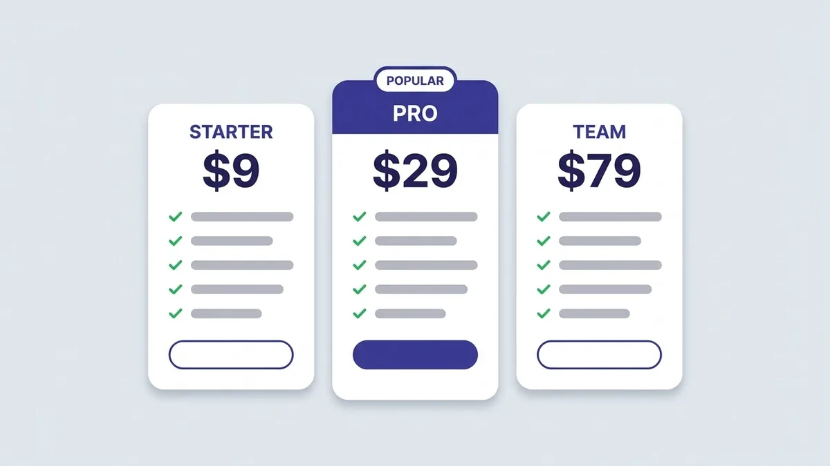
This prompt makes three plan cards with names, prices and five feature lines with check icons, with the middle card highlighted. Replace placeholders with your real plans.
Modern pricing table graphic with three plan cards named "[PLAN 1]", "[PLAN 2]" and "[PLAN 3]", prices "[PRICE]", five feature lines with check icons on each, the middle card highlighted with a "Popular" badge, [COLOUR] accents, rounded cards, clean SaaS style on a light background. --ar 16:9
Highlight the recommended plan with a different colour and a small badge.
Get a better result
A clean pricing graphic with three plan cards, your plan names and prices, five feature lines with ticks on each, the middle card highlighted with a “Popular” badge, in your accent colour on a light background.
Three plans with the middle one highlighted is a common pricing layout because it guides people to the plan most fit. Asking for the same five lines on every card makes the plans easy to compare. Rounded cards and a light background are the clean style people expect from software pages.
The feature lines are gibberish.
Fix: Use the image for the layout only, and type your real features in a design tool or on your web page.
- All three cards look the same. Ask for the middle card to be slightly taller with a coloured border and the badge, as the tip says.
- The prices are hard to compare. Ask for the price as the largest text on each card, in the same place on all three.
Ask for a small monthly and yearly switch above the cards, with “save 20%” shown next to yearly as a design idea.
Make the middle card slightly taller with a coloured border and badge, and put each price in the same place as the largest text.
More image generation prompts
See all 347 →
More like this
- Write pricing page copyChatGPT · Gemini · Claude
- Work out how to price your product or serviceChatGPT · Gemini · Claude
- T-shirt graphic for printIdeogram · Midjourney · ChatGPT
- Two-column comparison graphicGemini · ChatGPT · Midjourney
- Yoga studio class schedule graphicGemini · ChatGPT · Midjourney