Ideogram prompts for logos, posters and anything with text in it
Published
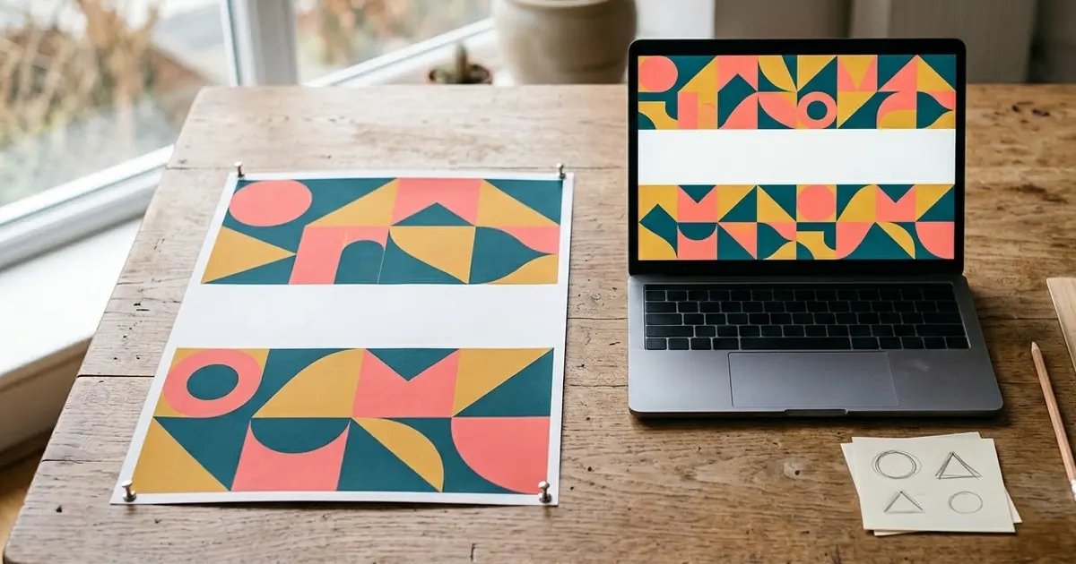
Short answerIdeogram is one of the more reliable AI image tools for text inside an image. Put every word you want in quotation marks, keep it short, and describe where it goes, and it usually spells the text correctly on the first try.
Most AI image models struggle with text. Ask for a poster with a headline and you often get something that looks right from a distance and falls apart the moment you read the letters. Ideogram was built with this problem in mind, which makes it the better choice whenever the words in the image matter as much as the picture.
This guide covers the habits that make Ideogram's text come out right, with copy-ready prompts for the designs people need most: logos, posters, business cards and social posts.
Why text breaks in most image prompts
Image models generate pictures from patterns in pixels, not from a spell-checker. A model that has never been pushed to get text right will often produce letters that look plausible at a glance but are subtly wrong: a missing letter, a doubled one, or a font that trails off into nonsense halfway through a word. Longer phrases and smaller text make this worse, because there's more room for the pattern to drift.
Ideogram, along with ChatGPT's image tool, is generally more reliable here, because accurate text rendering is part of what it's designed and evaluated for, rather than a side effect of generating a picture.
Put your text in quotation marks
This is the single most useful habit for any text-in-image prompt, on Ideogram or elsewhere: write out the exact words you want, in quotation marks, rather than describing them.
| Weaker | Stronger |
|---|---|
| a poster with a Diwali greeting | Text, spelled exactly: "Happy Diwali" |
| a banner with our sale | Headline "Summer Sale — Up to 50% Off" |
| a card with my name and number | "[NAME]" and "[PHONE NUMBER]" |
Quoting the text tells the model this exact string is the one to render, not a suggestion to paraphrase.
A logo prompt to copy
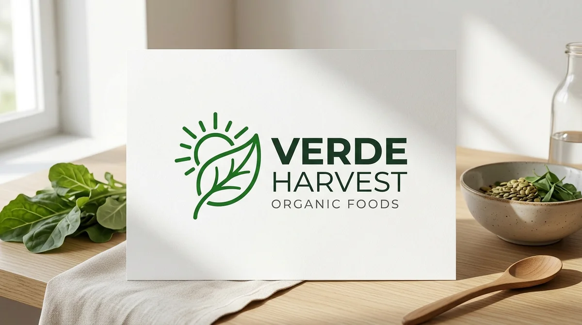
Design a minimal, modern logo for "[BRAND NAME]", a [WHAT THE BUSINESS DOES, e.g. homemade organic snacks brand].

Create a simple, memorable vector symbol that represents [IDEA, e.g. freshness and home cooking], next to the brand name in a clean, bold sans-serif font. Flat design, white background.
This is the minimal modern logo prompt from the library. Keep the brand name short in the prompt itself. A one or two-word name renders far more reliably than a long tagline squeezed into the same line.
A poster prompt to copy
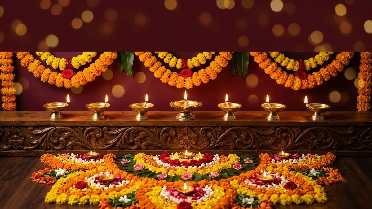
Design a festive greeting poster for [OCCASION] from "[NAME / BRAND]".

Visuals: [ELEMENTS] in a rich [COLOUR PALETTE] — elegant and premium, not cluttered.

Text, spelled exactly: "[YOUR GREETING OR HEADLINE]"
This follows the festival greeting poster prompt in the library. Its tip is the whole point of this guide: put every word of your text in quotation marks, because that alone is what helps the model spell it correctly.
Matching the prompt to the design
Different designs put the text in different places, and it helps to say so directly rather than leaving it to guess:
- Business cards: say which text goes on the front and which on the back, as in the business card design prompt. Keep the back mostly white space; cramming contact details in small text is where mistakes creep in.
- YouTube banners: keep the important text centred. The YouTube channel banner prompt calls this out directly, because phones and TVs crop the edges of a channel banner, so text near the border gets cut off even when the design itself is correct.
- Quote posts for social media: the quote post prompt works best with the quote itself under about 15 words. A long quote either shrinks until it's hard to read or starts to misspell under the strain of fitting more text in.
Fixing common problems
A letter is wrong or missing. Regenerate first; text accuracy varies between attempts even with the same prompt. If it's still wrong after two or three tries, shorten the text or simplify the font style you asked for.
The layout crowds the text. Add "generous margins" or "lots of white space around the text" to your prompt. Crowded layouts make the model compress the text, which is when spelling mistakes show up.
The text is correct but the font looks generic. Name a style instead of just "bold": "a clean geometric sans-serif", "a hand-lettered script", or "a condensed serif like a newspaper headline" all give the model something specific to aim for.
It's close but not quite right. Don't start over. Ask for "the same design, but fix the spelling of [WORD]" so you keep the layout and colours that already worked.
One rule that applies everywhere
Whatever tool you use, always read every letter of the generated text before you use the design anywhere real. Even a reliable model makes mistakes sometimes, and a wrong letter on a printed business card or a sale banner is far more expensive to fix after the fact than before you hit print.
Where to go from here
If the problem isn't the text but the rest of the prompt, our guide to fixing a Midjourney prompt that isn't working covers the same habits (specific subjects, clear parameters) for image prompts generally. All the prompts above are free in the Ideogram prompts collection, and the prompt builder can write a custom version with your own text filled in.
Quick checklist
- Put every word of text in quotation marks.
- Keep headlines and quotes short; long text is where mistakes creep in.
- Say where the text goes, especially for banners and cards with a front and back.
- Name a specific font style instead of a vague word like "bold".
- Always proofread the generated text before using the design anywhere real.
Comments
No comments yet. Be the first to share what worked for you.